B.I.G. Step By Step

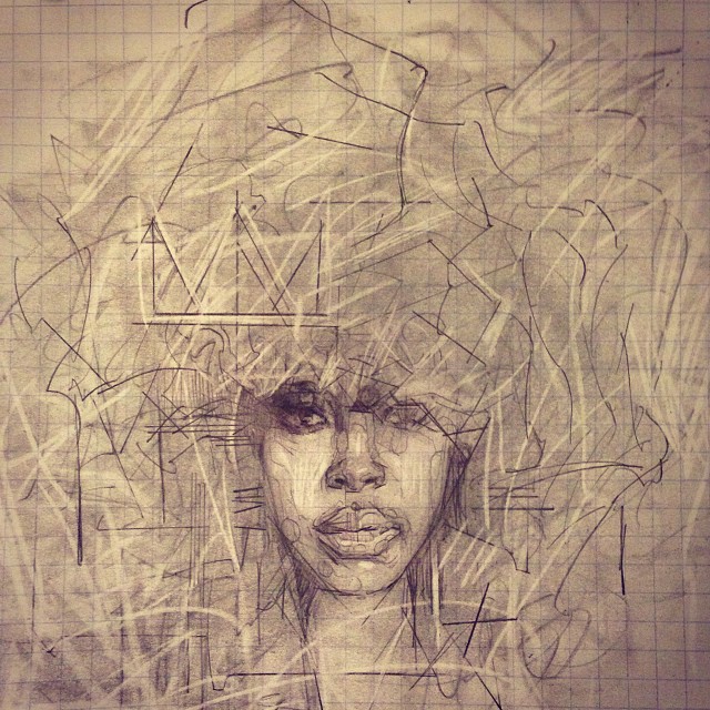
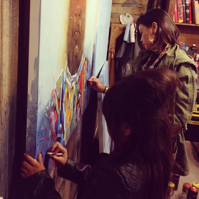
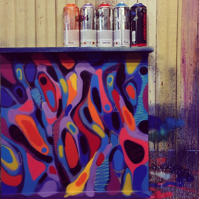
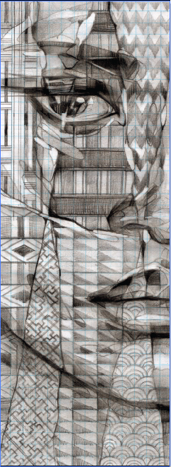
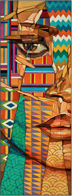
The following are some step by step photos of my process in creating a recent piece for my upcoming show at Cukui.  

For the most part, I try to avoid painting portraits of celebrities because I feel the work may lack a sense of wonder, and mystery. I also worry if people won't see passed their mental image of who the iconic figure is.  Most times I prefer anonymous faces to begin paintings with because I use them as a starting point. I usually try to keep just enough to highlight a certain expression. This sensibility is probably from my experience through graffiti where you basically tweak and reinterpret legible typography based on your feelings and movement.

Well for my current show, I am going against my usual thoughts on portraiture. For a while now i have been wanting to paint a series based on various musicians through my own artist lens because music has provided so much inspiration and therapy for me. Due to my own prejudices on this type of portraiture I have avoided it. But damn it, sometimes you just gotta let it out! I hope to go past what a photograph can capture by absorbing a feeling and releasing it through the work.

Who is The Notorious B.I.G.? Certainly I don't know. Is he a Coogi pattern with shades, and a crown? I started with these elements, which are so very graphic as visual identifiers, and decided to abstract them and find new forms and compositions. I'm not sure what you get from it as I cannot dictate your feelings but I definitely stumbled onto some unexpected results and stopped the painting at a place that I feel is new and interesting. Enjoy! 
Source: http://samrodriguezart.com

Work In Progress.

It's been a pretty busy fall and end of summer. Luckily though I have been able to manage between family and work really well thanks to the new studio space. I still have yet to do a full post about the recent installation over at Oakland Museum of CA because I need to get proper photos.

The good news is I have had to jump right into new projects. The first is a show I'm working on for December of this year at Cukui. The pieces will be what I call a visual playlist. Basically it's a series of portraits dedicated to international and local musicians. Public Meridian, a San Francisco based brand that makes custom bracelets will be creating pieces that coincide with each painting. It should be interesting to see how they translate the music and my art into bracelets. I am most inspired by music when it comes to art, and various types at that. Of course it's really challenging to distill so many great musicians into a small handful to be painted so we voted on some of our favorites based on their international, and local impact, while being conscious of Cukui brand and their following. Since this series can be expanded on, we will most likely continue afterwards. 

Meanwhile, I am also working on releasing more prints with 1xrun as our first release was a success. I am also going to be doing a Japanese pop series with Yamamoto Industries that will be produced as iphone cases and limited edition prints.  

Lastly, when this is all said and done, my goal is to begin a new series of pieces. They will still involve bits of  typography, hybrid identity, and topography but rather than painting the dissection as I have done in the past I would like to actually cut through the surface using power tools and other building materials. I think this will open up many more possibilities on how to think about the topic. 

Here are some in progress pics. 
Enjoy!


Wall by Aaron De La Cruz

I finally had the chance to view this nice looking wall painted by my good homie Aaron De La Cruz in San Pancho. Enjoy! 
Taste The Arts Event

This weekend I had the pleasure of taking a road trip down to Visalia California (Central California). I was invited by my long time friend and fellow artist Eric Gonzalez who heads an organization named Urbanist Collective. They contributed to a citywide event in Visalia that traditionally involves agricultural food tasting.

For this event Urbanist Collective was brought on to bring some new flavor to an old school show. So they curated a live outdoor mural jam involving local artists and others from all over California, including the Bay Area and L.A. My impression after making connections with some locals, fellow Yay Areans and Los Angelinos is that this event could become an annual midpoint destination for Californian creatives to jumpstart the works of the future. Here's a pic of my contribution, and a few of the many good folks I befriended during the process.

Thank you Eric and familia, Urbanist Collective, and the City of Visalia.


Recent Experiments

I recently completed this painting based on a sketch style that I've been wanting to develop. The portrait is still based on my original intent of experimentation using the face as a platform to combine different visual cues in identity. For me this piece was a breakthrough because I have finally come full circle in my artistic process since I included my experience acquired both in graffiti and at the academy. This was done through the use of material such as spray paint, streaks, markers, and abstract lettering which I incorporated through the face and head piece. For me, the fusion shown in this portrait is less about ethnicity, or culture but more about a combination of artistic time periods, expressions and techniques. The process itself involved so many different ingredients. I think I've finally found something that shows a true sync between my hand and mind.

San Jose Museum of Art Mural

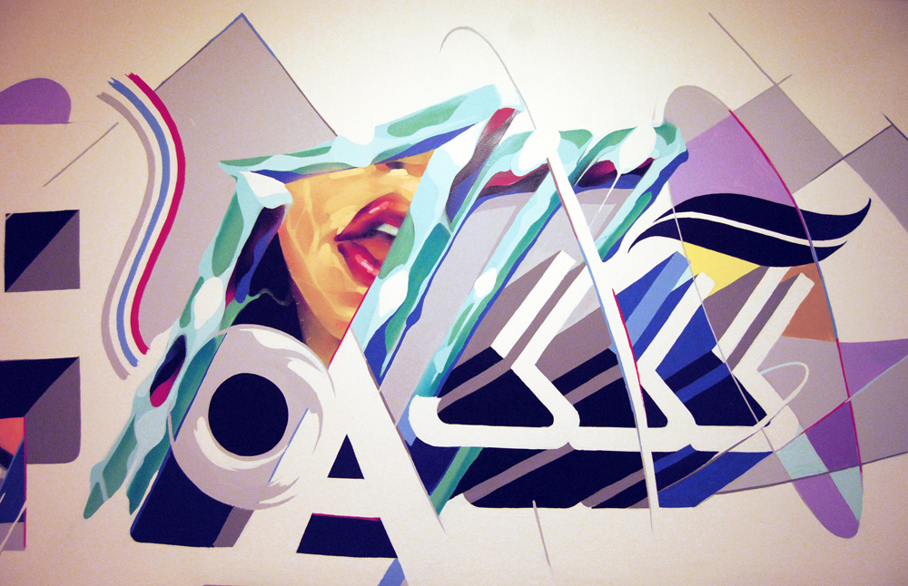
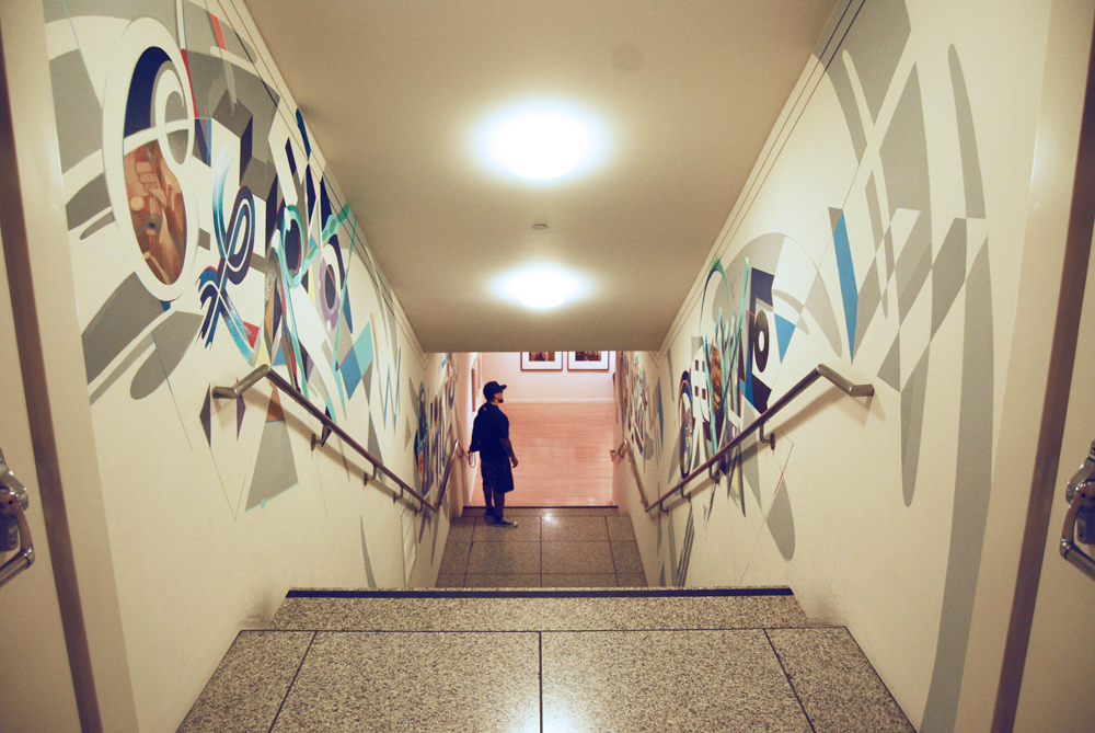
This is a wall I painted for the San José Museum of Art a little over one year ago. It's almost going to be removed for the next show, and I never got a chance to post it up until now. The wall is a passage way from the main lobby to a downstairs gallery. The Museum approached me to do the mural with total free range on creativity as long as I touched on the concept of typography which was the topic of exhibited works for the approaching gallery. This is the result, and I wish I had better pics! 
Oakland Museum Update - Part 2

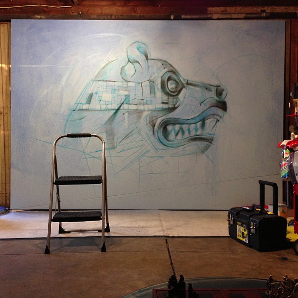
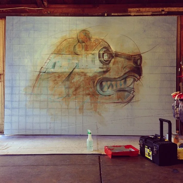
This is 1 of 2 wall installations I painted for the Oakland Museum of California. The wall will be displayed in their Natural Sciences Gallery as a part of OMCA's annual Dia De Los Muertos exhibition. The curator, Eduardo Pineda was interested in creating a show that put Dia De Los Muertos in the context of natural sciences and California. This image is in honor of the California state Grizzly bear. The image was inspired by Nahuales which is the belief in some Mexican traditions that everyone is born with a spirit of an animal who is responsible for protecting and guiding us. In this case I was thinking of the Grizzly as a Nahual for our state. Unfortunately we've killed off all of them in the state of California. 

New Studio!

Just recently landed my first work studio! Its small, but has just what I need to get work and studies done. I recently cleaned up the spot and added some of my own essentials. I've already broken it in this week with some graphic design, drawing, and painting. The work flow has improved so much since now all my tools are in one place. The best part is the large wood sliding doors which provide some great ventilation when I use spray paint. Below is a before and after pic. YEEEE!  

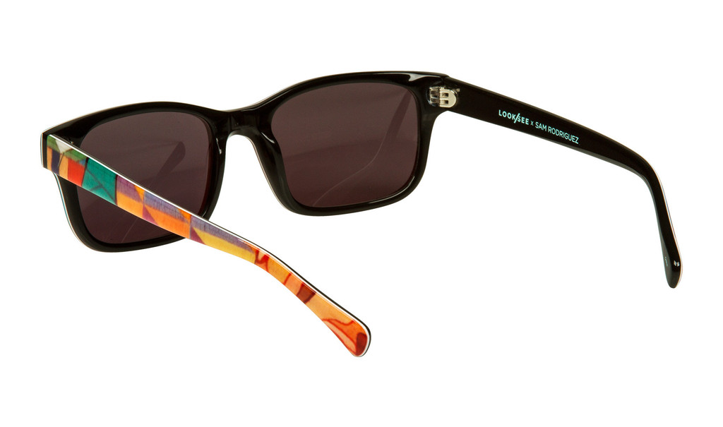
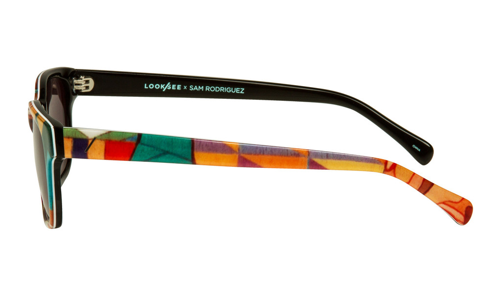
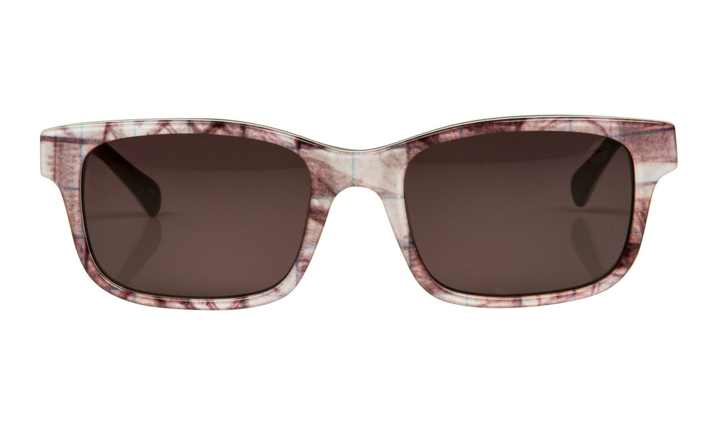
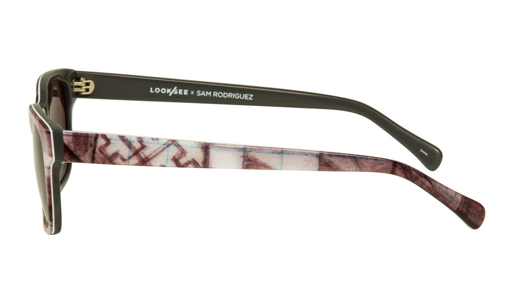
LOOK/SEE x Sam Rodriguez

Click here to purchase>> Look/See!


Words by Look / See:

LIMITED EDITION:  
Limited to only 50 pairs. Once thes are sold out, They will not be made  again. 

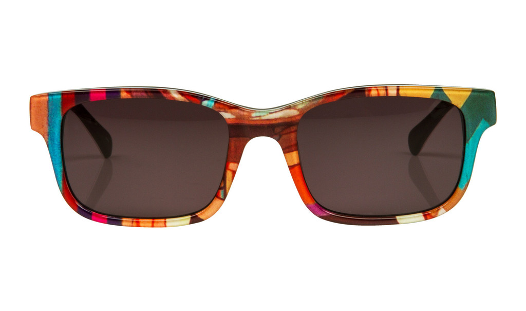
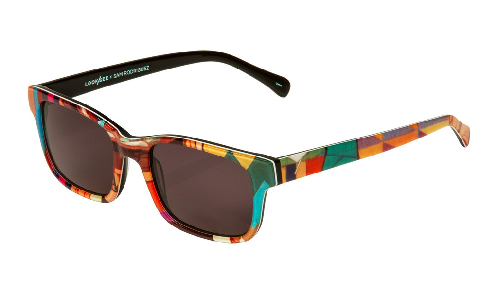
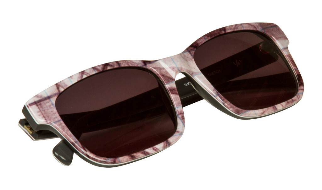
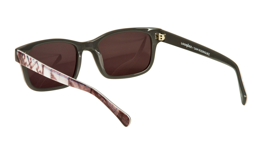
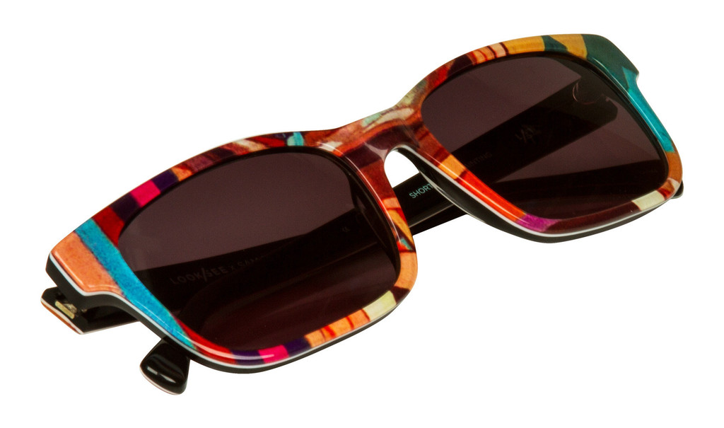
ARTIST collab:  LOOK / SEE ITS Continues 2013 LOOK / SEE Artist Series with a special collaboration with  Sam Rodriguez . Sam is an incredibly talented artist based out of San Jose. Sam Created to sketch and painting whichis matched the size of the raw acetate sheets we used to make the frame. Sam you have a very unique style and provides whichis Interesting blend of color and Geometric patterns whichis connect the cultural thematic elements of historical work. From the custom Materials we developed, the frames Were Cut Out at random so thatâ in two frames are the same. Be sure to check out the OTHER "sketch" piece  from this collection, Which is based off of the artwork's original sketch.

FRAME:   Custom artwork depicting acetate Created by Sam Rodriguez On The Outside, black on inside.

LENS COLOR:   Dark Grey

LENS MATERIAL: 100% UV-protectant CR-39

FRAME SIZE:   53mm (width of lens) - 19mm (Distance Between Lenses) - 145mm (temple length), 4.5 base curve