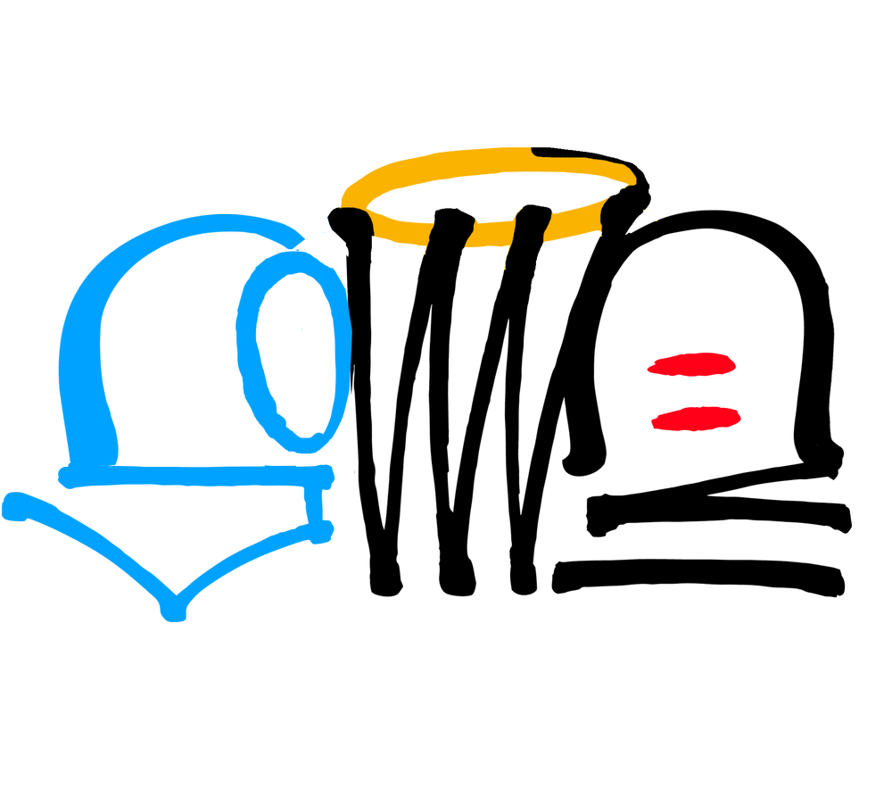
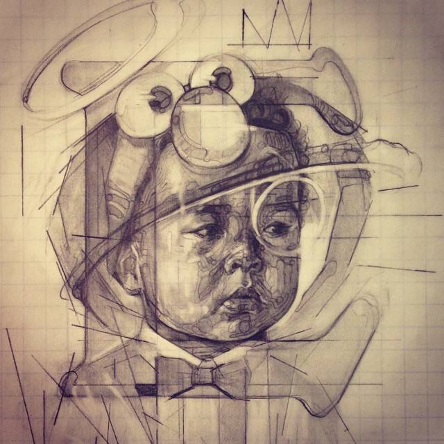
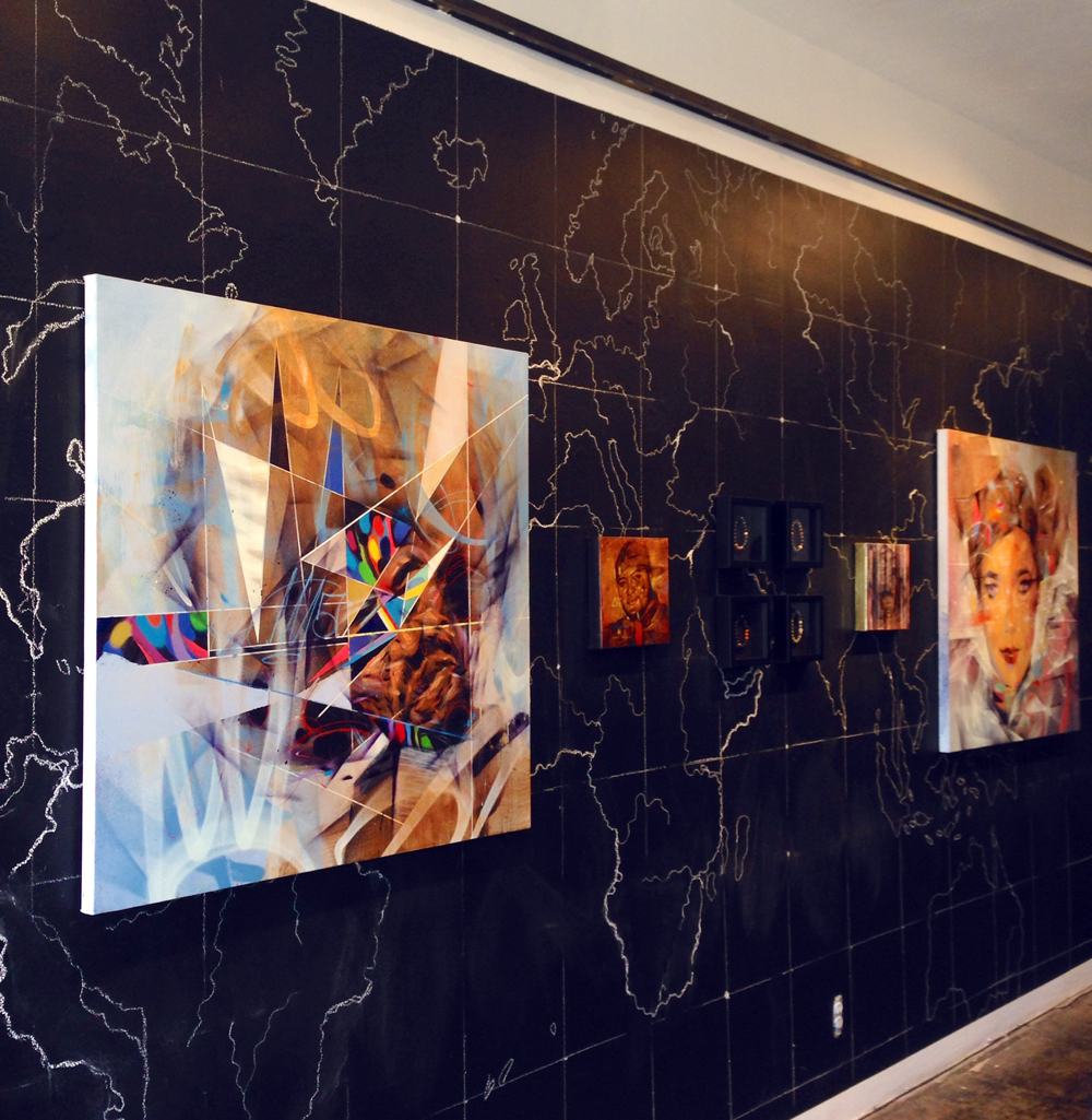
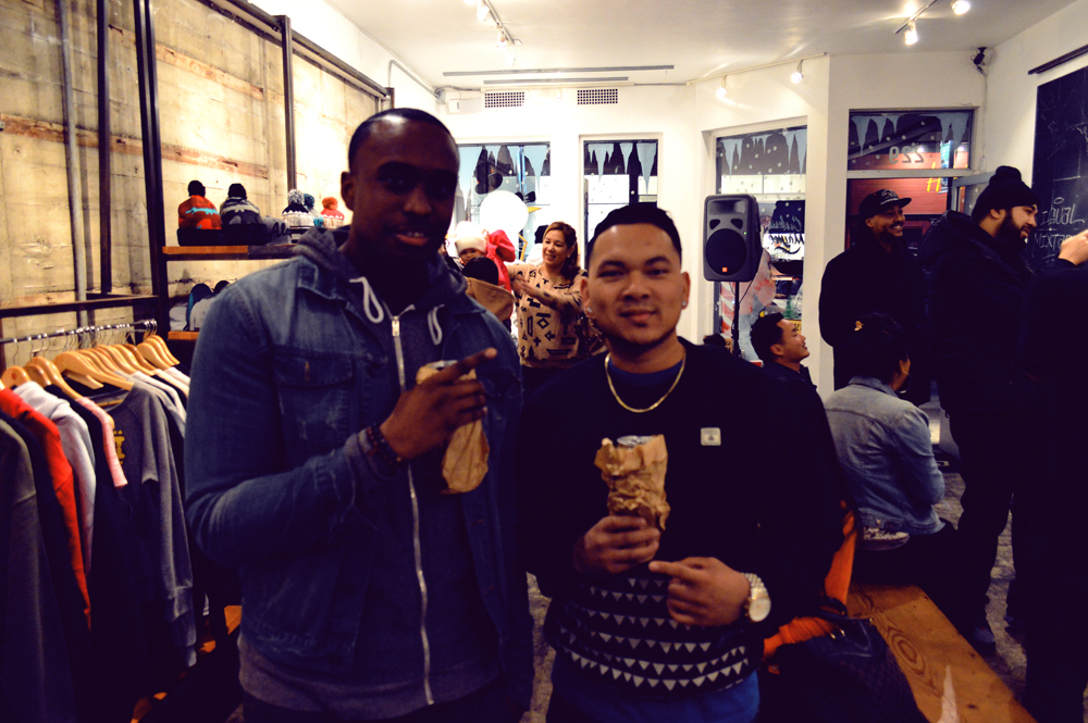
Here is a piece I recently completed using gold paint as a base for Bishop on Bedford Gallery in Brooklyn N.Y. They are hosting a group art show curated by the legendary DJ Clark Kent for the 20th anniversary of Biggie's debut album 'Ready To Die'. This is my remix based on the original album cover. Will there be prints? Of course there will so stay tuned.
Type Face Wall 3
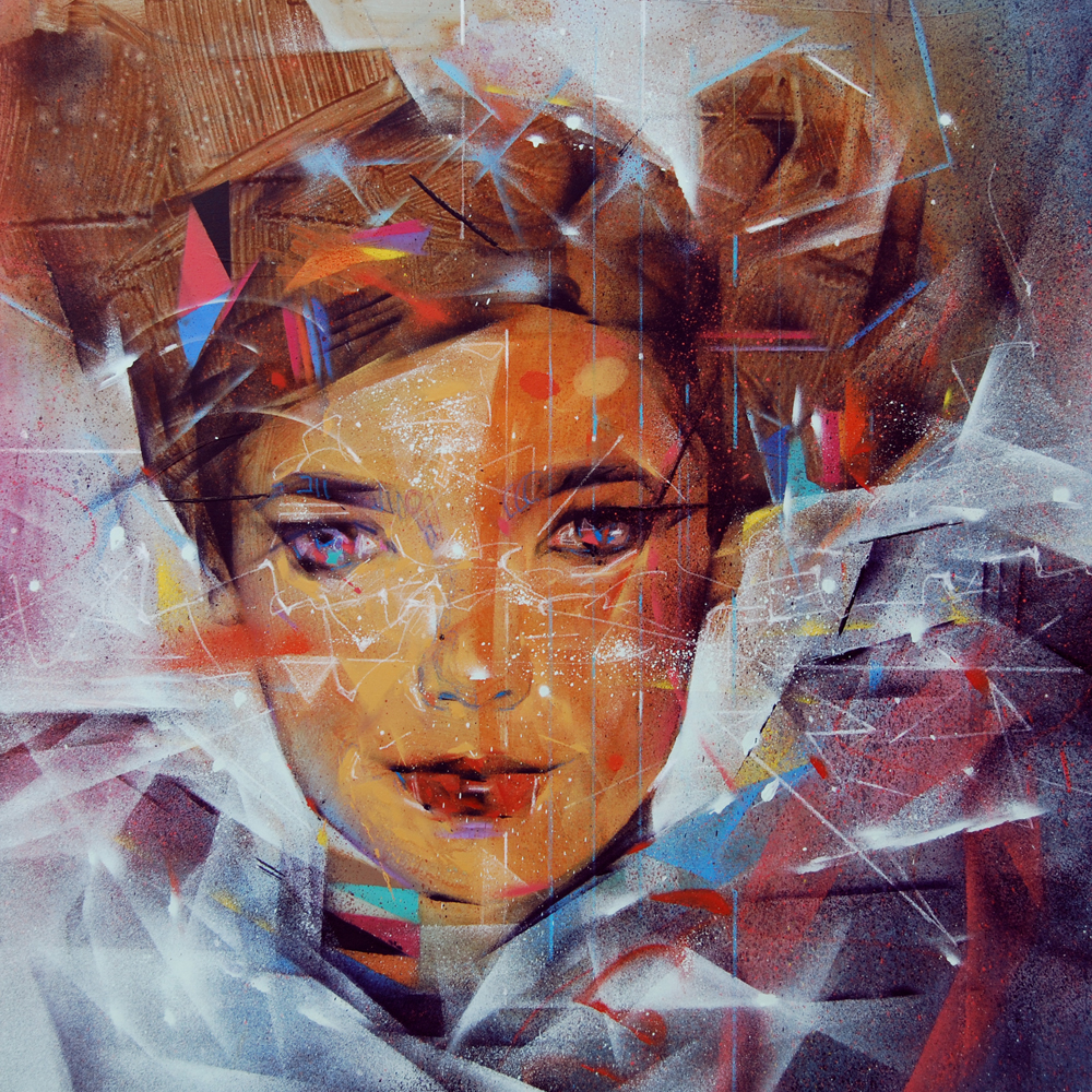
I recently decided to take my ongoing Type Face portrait series to the walls. Here is the third which was also my contribution to Wall Therapy in Rochester, NY. These are part of my ongoing body of work involving mixed identity portraits. This time the emphasis is on juxtaposing different languages and typography. Enjoy!
Type Face Wall 1
I recently decided to take my ongoing Type Face portrait series to the walls. Here is the first. These are part of my ongoing body of work involving mixed identity portraits. This time the emphasis is on juxtaposing different languages and typography. Enjoy!
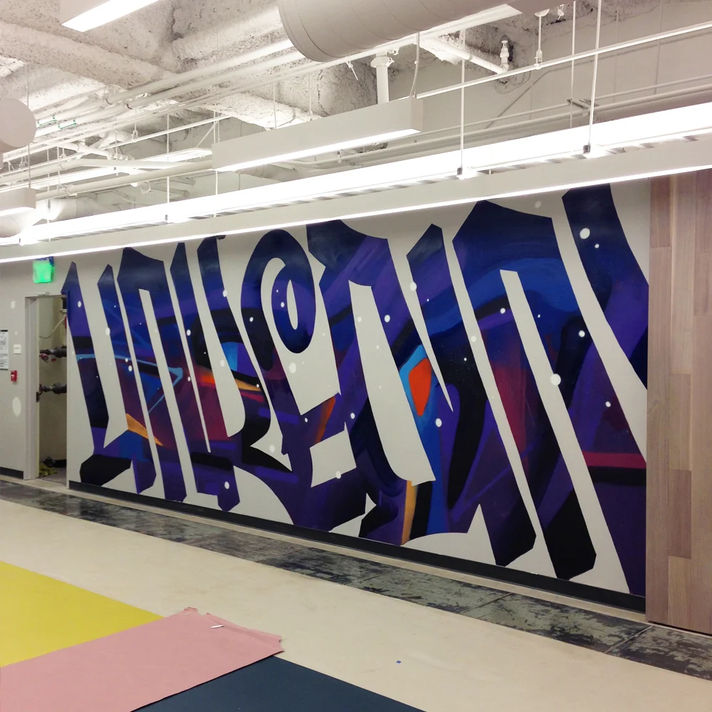
Linked In SF
Here is a wall commission I painted at Linkedin San Francisco Offices. The wall spans 100 feet wide and the concept is based on a 'meeting of minds'. Enjoy!
Ellington
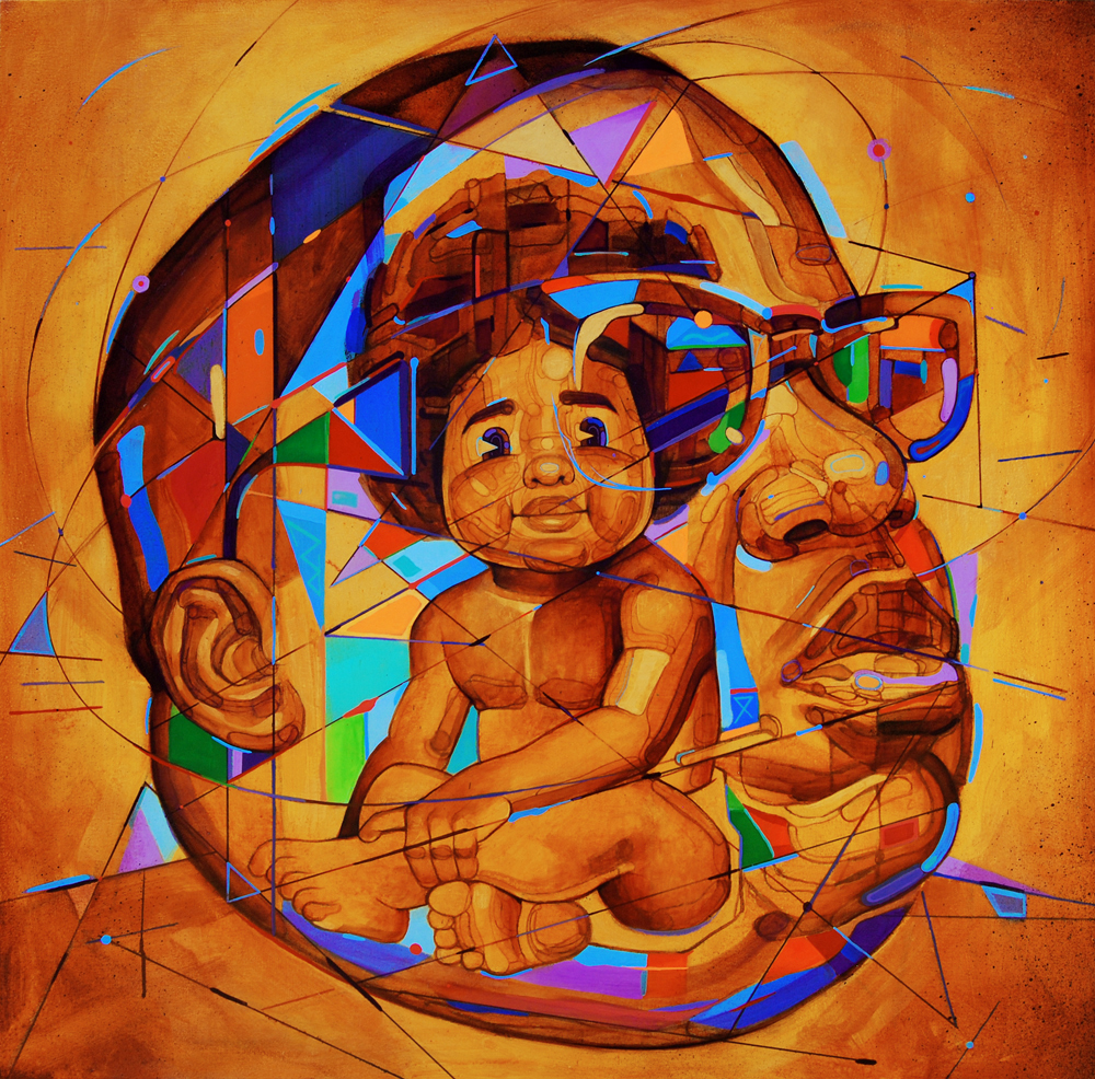
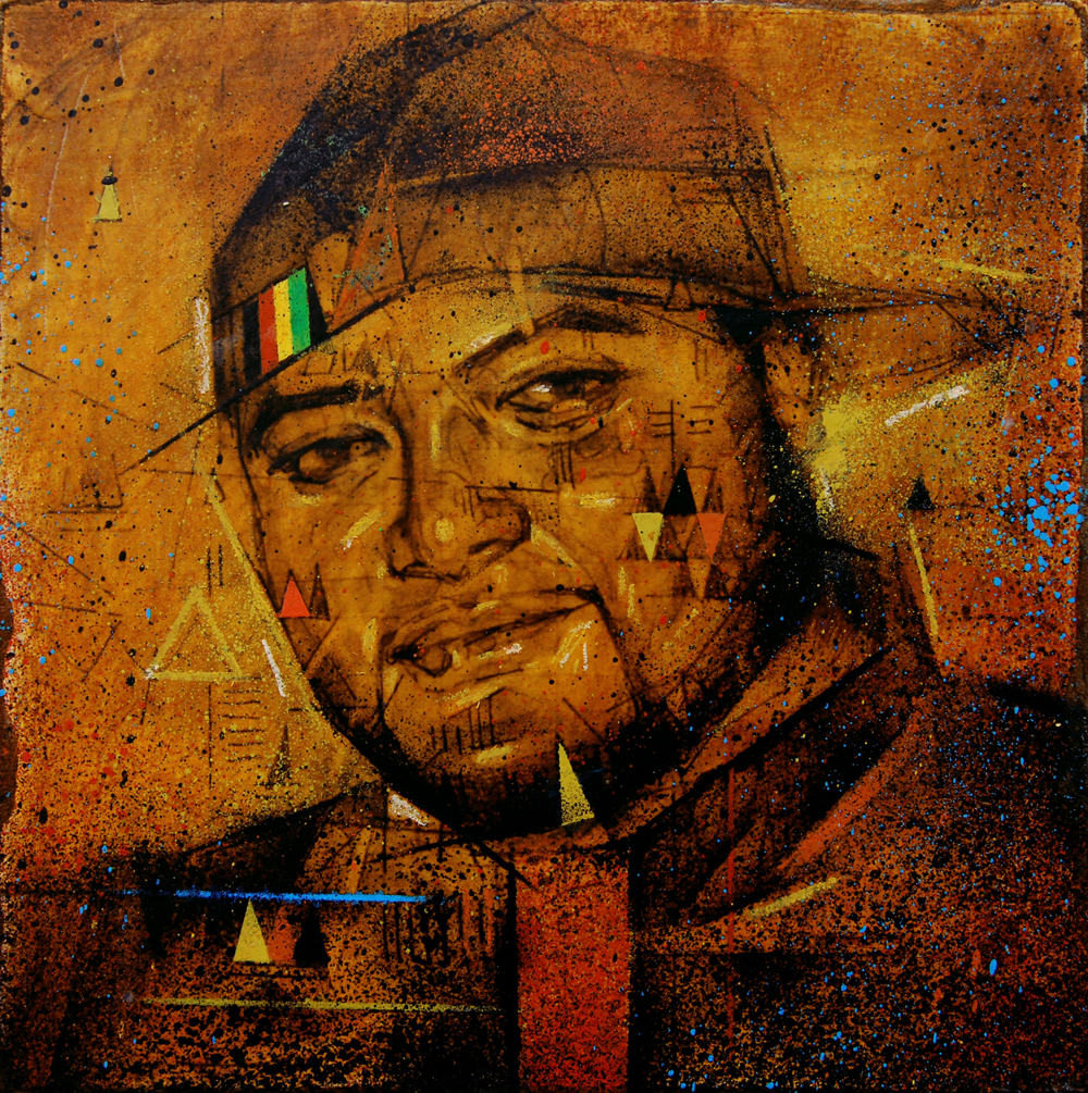
Here is a piece I recently completed for Coltrane Curtis of Team Epiphany. Curtis, who is the son of one of my favorite musicians John Coltrane gave me the honor of portraying his son Ellington. In the spirit of creative experimentation such as the music of his father John, I decided to blend digital with hand made application. Hope you enjoy.
Complex Mag Portfolio Review
Complex Mag recently asked me to participate in their online Portfolio Review series. Here is a link to how that went including brief thoughts I have behind some of my works. Click here to read more: http://www.complex.com/art-design/2013/12/samuel-rodriguez-art-portfolio-review/
Words by Complex: "Samuel Rodriguez's paintings capture the multifaceted identities of his subjects. Instead of portraying an ideal whole, he fractures his compositions to suggest that we are made up of more than just a single belief, history, or culture. Rodriguez touches on themes of race and ethnicity, stressing that in our diversity...Read full article here >>
Limited Print. Limited Time.
I have just released another Print with 1xRun. The Original Painting, and Sketch are also available. Here is an interview I did with them and a link to where you can purchase. http://1xrun.com/runs/Softball_Cap_Original_Artwork
Show Recap: Visual Mixtape
VISUAL MIXTAPE
by Sam Rodriguez & Public Meridian.
A compilation of our favorite multinational subjects visually manifested through graphics and custom bracelets.
The Show
Last week I came together with Public Meridian for our debut collaboration to celebrate internationality. This is the first in a series we are beginning on cultural blending and common interests that have been rising on a global level. Musicians were the topic of choice for this first show since they have such a universal impact. The “playlist” was based on our collective likes and what we think is important to our hosts, Cukui. The criteria for this compilation was that it had to have an international and local feel to it.
We hope you enjoy!
-Sam
The Goods
Original Paintings, and a box set that will includes a signed limited edition print and a custom bracelet that illustrates selected musicians. Cukui also made a limited edition tee based on one of my paintings. There are only a few of them left available through Cukui.com.
About Public Meridian
Public Meridian is an independent label from San Francisco that produces custom and limited edition bracelets.
Bjork Box Set: Signed Print & Bracelet (made from Aqua Terra Jasper and Amazonite). Limited to 8 Editions.
Erykah Badu Box Set: Signed Print & Bracelet (made from Amethyst and Leopard Jasper). Limited to 10 Editions.
J Boog Box Set: Signed Print & Bracelet (made from Lava Rock, Bayong Wood, & Wood Chips). Limited to 10 Editions.
Mac Dre Box Set: Signed Print & Bracelet (made from Snow Obsidian and Multi Color Stone). Limited to 10 Editions.
Click Images to Enlarge...
Process & Self Discovery
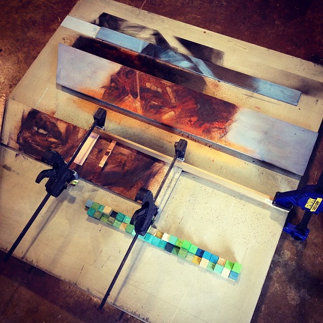
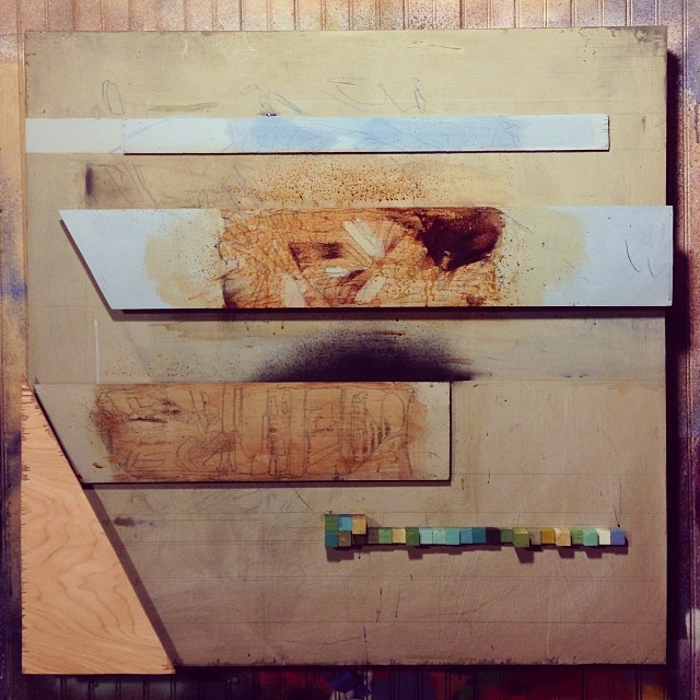
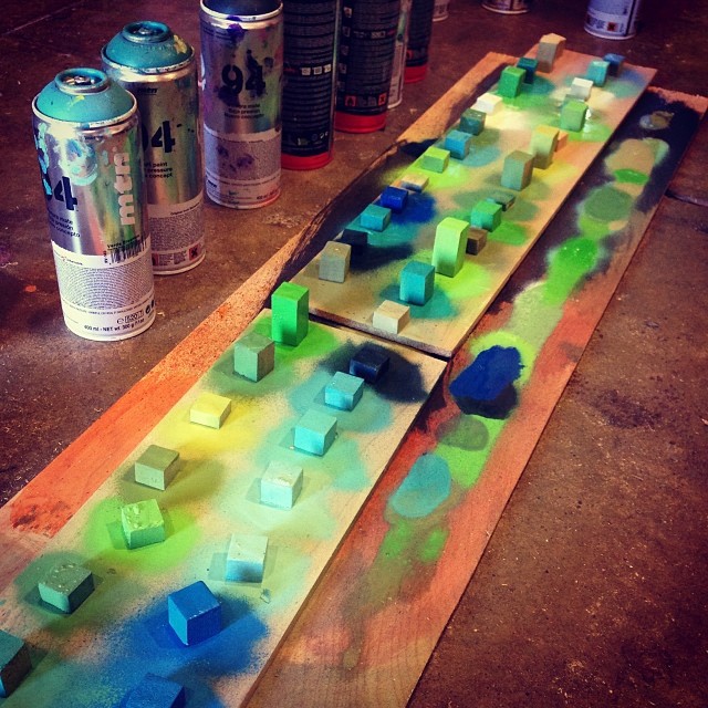
I have finally completed a piece that I am somewhat satisfied with. This was also one of the most transformative ways I have ever worked which included many stages in the process. The result has been very rewarding and I think I am beginning to fine tune my voice as an artist. It started as my usual random sketch which I selected from an instagram post awhile back and then turned into a loose digital mock up which finally became the schematics for a mixed media frenzy that you see here. I guess you can say it went from software to hardware. I think the reason why I am content with this one is because it mixes all of the things I love most in visual art such as graphic design, portraiture, sketching, digital references, 3D architect modeling, patterns, and graffiti marks. I especially loved working with less with paint and more with the hardware. One thing that stood out about the process was its similarity to cooking in that I needed to prepare the "ingredients" ahead of time which were the cuts and shapes that would later be applied to the final. I call this piece "Notes" inspired by the different tones in music and mood. This will be the first of many to come. Enjoy and feel free to comment!
Vote YES in the comment box for this to be the next First Friday Release!
B.I.G. Step By Step
The following are some step by step photos of my process in creating a recent piece for my upcoming show at Cukui.
For the most part, I try to avoid painting portraits of celebrities because I feel the work may lack a sense of wonder, and mystery. I also worry if people won't see passed their mental image of who the iconic figure is. Most times I prefer anonymous faces to begin paintings with because I use them as a starting point. I usually try to keep just enough to highlight a certain expression. This sensibility is probably from my experience through graffiti where you basically tweak and reinterpret legible typography based on your feelings and movement.
Well for my current show, I am going against my usual thoughts on portraiture. For a while now i have been wanting to paint a series based on various musicians through my own artist lens because music has provided so much inspiration and therapy for me. Due to my own prejudices on this type of portraiture I have avoided it. But damn it, sometimes you just gotta let it out! I hope to go past what a photograph can capture by absorbing a feeling and releasing it through the work.
Who is The Notorious B.I.G.? Certainly I don't know. Is he a Coogi pattern with shades, and a crown? I started with these elements, which are so very graphic as visual identifiers, and decided to abstract them and find new forms and compositions. I'm not sure what you get from it as I cannot dictate your feelings but I definitely stumbled onto some unexpected results and stopped the painting at a place that I feel is new and interesting. Enjoy!
