Solo Show | Typefaces: Caras De La Misión

Click images for larger view>>

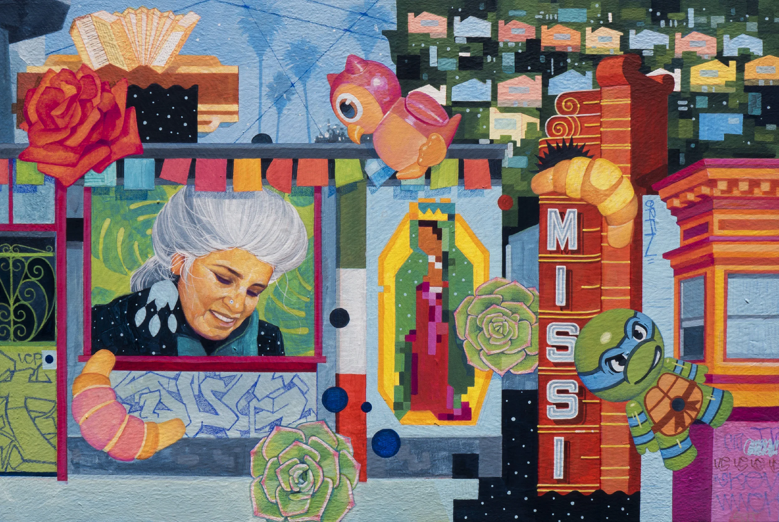
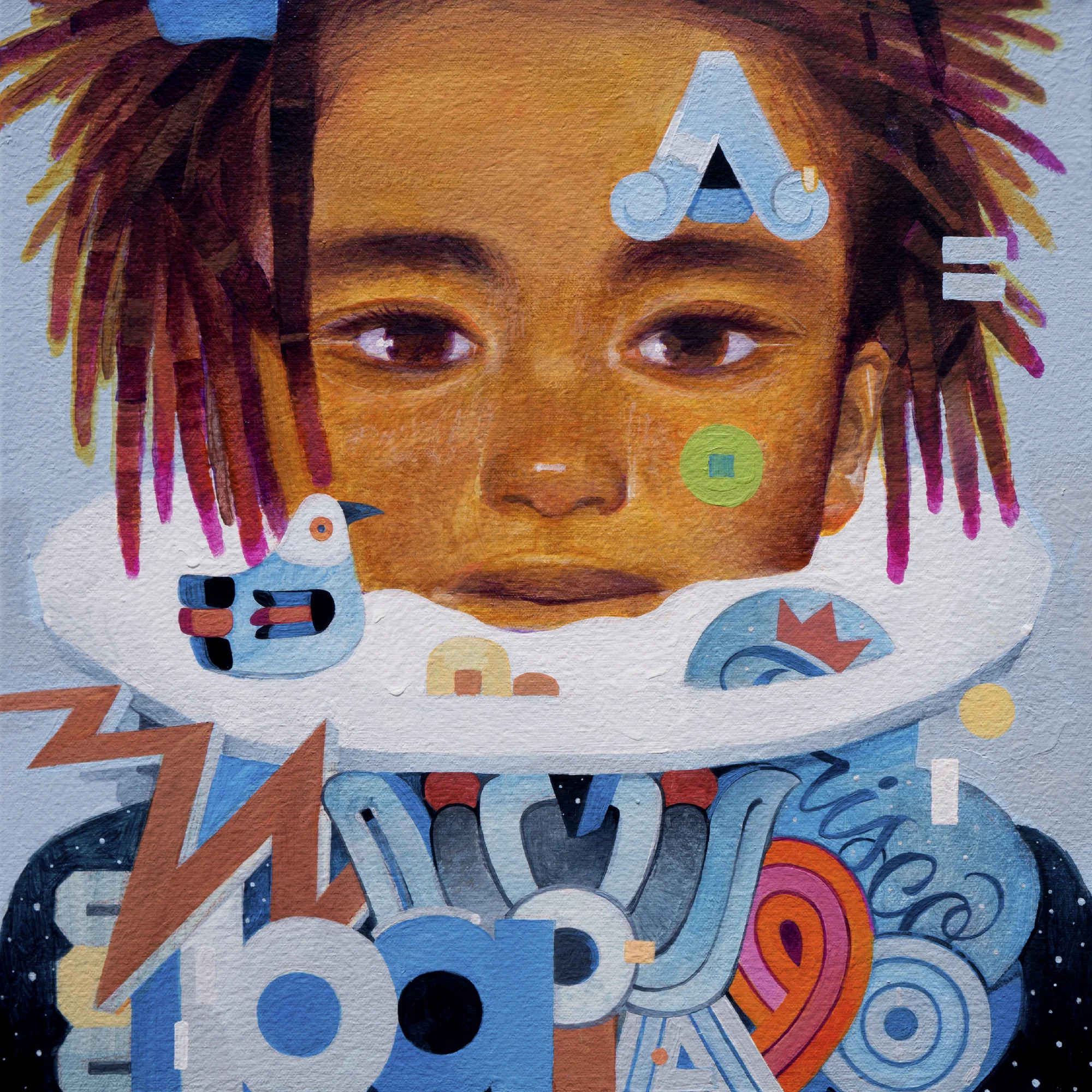
Greetings! I am happy to announce my newest solo show, 'Typefaces: Caras De La Misión'! It has been about four years since my last one and I am glad it is being hosted here in the Bay Area, close to home. I was invited by Acción Latina’s Juan R. Fuentes Gallery, to do a location-specific version of my 'Typefaces' series about their neighborhood, San Francisco's Mission District. It was a challenge that has helped me to further realize my voice as an artist. Below is some information about the show, if you are in or around the SF Bay Area, please take some time out to see these in person and enjoy some good food around the neighborhood!

Acción Latina’s Juan R. Fuentes Gallery
2958 24th Street, San Francisco
Curator/Artist: Myself (Samuel Rodríguez)
Displays: June 3, 2017 – July 28, 2017

Words From Acción Latina: 

With his new exhibition Typefaces: Caras De La Misión San Jose-based visual artist and graphic designer Samuel Rodriguez depicts the unique cultural landscape of the Mission District via observations of people, their distinctive features and their surrounding environment. This exhibit is part of an ongoing portrait series called “Typefaces” which examines social and cultural hybridity through sampling and remixing visual cues that we use to process identity in faces, typography, fashion, and architecture. Caras de La Misión includes familiar neighborhood faces—both past and present—with tones reminiscent of the ‘80s and ‘90s-era Bay Area, and is dedicated to the resilient community of the Mission District. At a time of rapid gentrification and displacement, Caras de La Misión helps to forge a cultural bridge across the Bay Area, establishing a creative dialog between Latino communities in San Francisco and San Jose.

Join the Facebook event page for further information.
 

Below is a video by Accion Latina about the process of making the show.

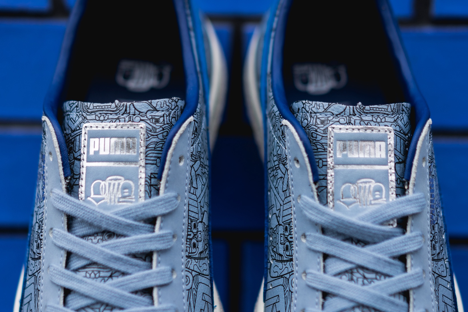
Puma X Sam Rodriguez x 1800


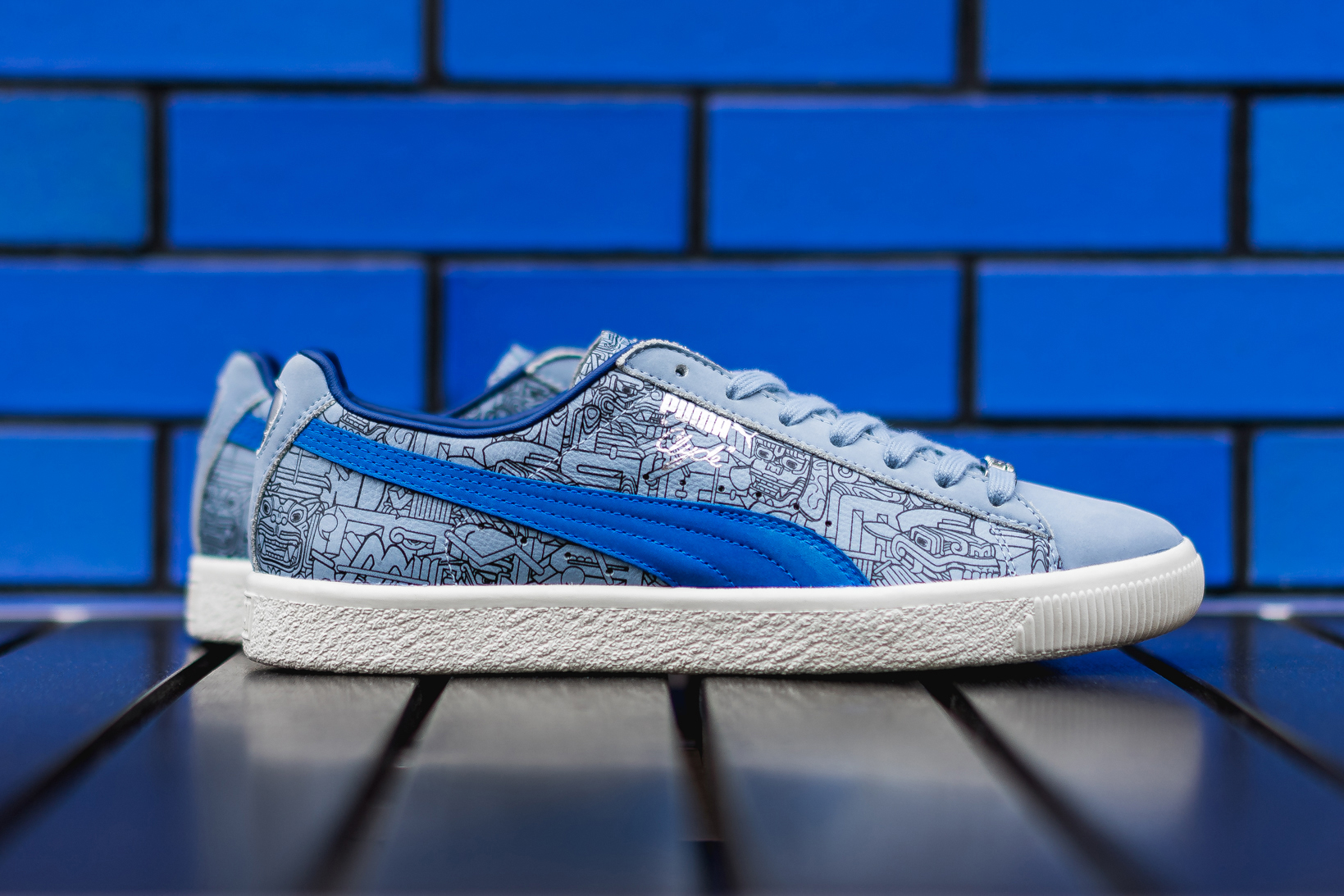
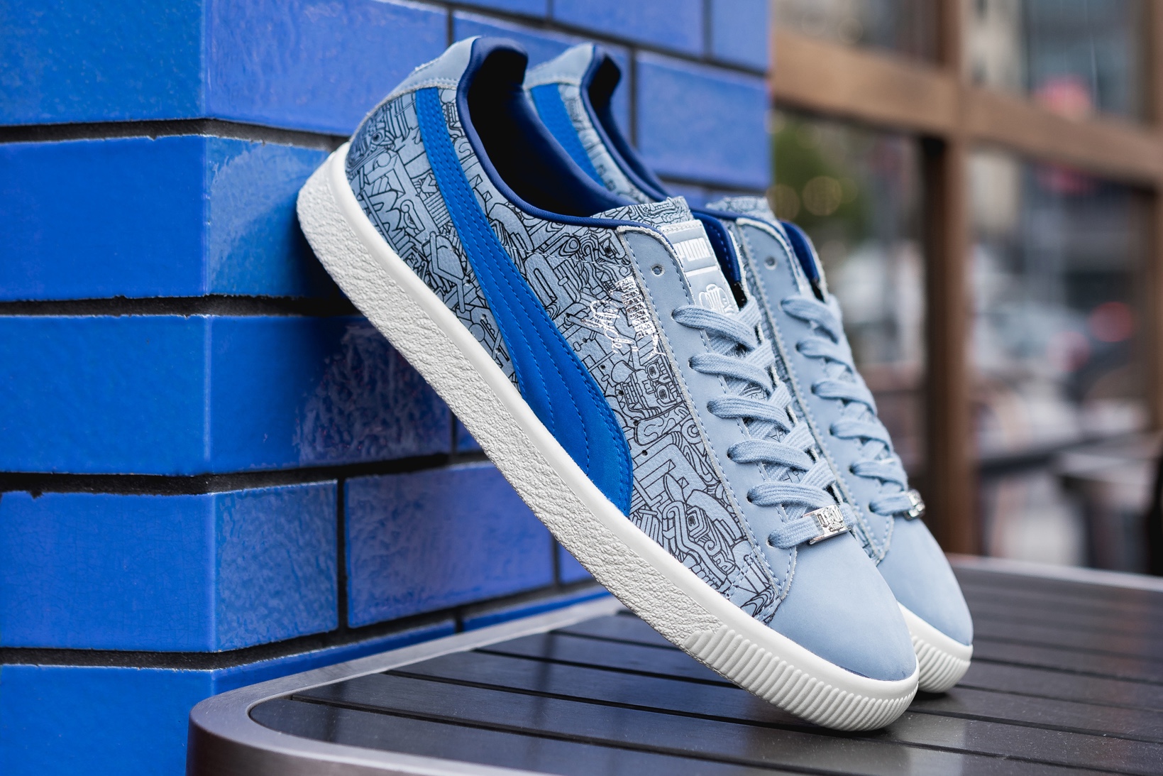
I recently had the opportunity to work on a collaboration between Puma and 1800 Tequila. It was a bucket-list project of mine because I have always wanted to design my very own Puma Clyde. It felt great to give art direction, from choosing materials, colors, and doing a custom illustration for a classic shoe that I sported during my formative years as a teenager doing graffiti. Below is more information about the project and a video by Hypebeast about the design process.
 

Words From Hypebeast: Following an early preview of the 1800 x Sam Rodriguez x PUMA “Cinco de Mayo” Clyde , we now have a full on-feet look at the collaborative sneaker. Detailed close-ups of the special edition Walt Frazier classic reveal the intricacies of Sam’s signature art. The line drawing all-over print remixes Aztec and Mayan imagery from hundreds of years ago and contemporary graffiti style graphics. While Sam’s work takes the foreground, a royal blue formstrip overlay contrasts the backdrop of the primarily light blue upper. Details are rendered in metallic silver and the color scheme as a whole nods to 1800 Tequila’s recognizable bottle and logos. Sam’s signature appears on the insole and tongue, and a metal 1800 embossed lacelock completes the package.

The triple collab is limited to 1,000 pairs and will not see an in-store or online release. Instead you can text “1800” to “55755” and check out more information on the official rules to get your hands on a pair.


New Work

Two pieces I recently painted. (Left) 'Kae', (Right) 'B'

The Gradient of Perspective

The following is an article I recently wrote for Silicon Valley Debug. To find out more about them or view the article on their page, please visit: 
https://www.siliconvalleydebug.org/stories/the-gradient-of-perspective-at-the-euphrat-s-museum-s-exhibit-justice-for-all

The Gradient of Perspective at The Euphrat Museum's Exhibit: Justice For All?

I’m honored to show artwork alongside powerful voices in the Euphrat Museum’s exhibit ‘Justice For All?’ at DeAnza College – a group exhibit about our collective history and the effects on individual lives and systems. The exhibit’s curator wanted to combine works like mine, which weren’t direct responses to specific events, with works that could be described as responses and answering the question of, where do we go from here?

I felt like the pieces from my summer of ‘16 series were right at home in the exhibit. That summer proved to be a season that exposed many of humanity’s negative attributes, and sometimes its grace. That summer was eventful in the media with critical situations popping off locally and abroad; the Pulse nightclub shooting, missing students in Oaxaca, Syrian crisis, gender inequality issues, police shootings, ridiculous presidential candidates, floods in Louisiana, contaminated water in Michigan, Rio Olympics and so much more. I absorbed all of it and created an album of visual responses titled, Summer Of ’16. In these pieces I felt like it was important not to repeat what had already been broadcasted or give a matter-of-fact literal reaction because cameras, eyewitnesses and journalists already provide that.

An artist’s role emerges out of their surrounding environment. Because of this, some artists who have been affected by injustices can’t help but have a strong urge to create works around this theme. As an artist, you are constantly observing behaviors in search of what’s next and sometimes unfortunately not all of what you encounter is good but is inspiration nonetheless. For those of us who are established and fortunate to have a platform that may inspire others to affect change, it is important that we use this power as often as possible; it is our duty. But just like society as a whole, the works will vary as is necessary.

In a sense, that is what I observed during my walk through of the show: A gradient of responses some dark and some light. One piece by Oreé Originol introduced me to an entirely new approach to art making. He showed part of his ongoing series titled, Justice For Our Lives, portraits of individuals from marginalized communities who have been shot and killed by police.

The pieces are available for anyone to download a­nd share. His website states, “You are encouraged to get creative with the designs, print, and distribute them at demonstrations, in classrooms, art galleries, as street art, and anywhere else that will force people to remember the names, faces, and the stories behind each person who has been killed by state sponsored terrorism.” This body of work was made in response to unfortunate events, but I couldn’t help but notice the innovation behind it.

As an artist, I have mostly come to understand my profession as something that is mostly available to people who have the capital to afford it. Although I share it free via social media, the body made by Oreé bypasses that notion and makes the art even more accessible. Murals do this too, but the fact that one can download, print and or share the art is much more empowering since the viewer is an active participant in the completion of the piece.

My own work is about studying the visual cues of identity, and what I often notice is that these aren’t as concrete as we think. These days, there are so many commonalities and overlap. For example, if I do a portrait mixing Arabic with Roman typography, and add some pale and dark skin tones, now you have a figure that isn’t so easily defined. This provides viewers with an invitation to wonder about the figure and create meaning from their own point of view. One might recognize a portion of the work, while another might see it as illegible abstraction. By distorting visual cues I hope that people will realize more of our common lineage. During this time in our history, it’s more important than ever to remind people of this because once someone can understand and feel another person’s perspective, it is easier to see that we all laugh and cry.

I used this approach for the series by sampling the common themes of the tragic events. For example, I made a piece about the missing students of Oaxaca, and the mass shooting in Orlando; both unfortunate situations about young Latinos. I also did a couple of pieces with Arabic typography because there was so much negative coverage of Middle Eastern people and I felt the urge to ally with them by reminding people of their beautiful contributions. For me, remixing what we process as visual information is simply a thought and then a pencil mark. They might not make literal sense, but not everything can be within our grasp of explanation. We have the expansive gift of intuition and feeling which is what allows us to process such abstractions. If we allow ourselves to be comfortable with not knowing, I have hope that we will evolve away from fearful seeing.


The Justice for All? group exhibit at DeAnza’s Euphrat Musuem is up thru March 23rd
Paint it Forward

Upcoming show at Cass Contemporary gallery. Paint It Forward is a group show that asks established artists to pair up with emerging ones for the creation of new works. I used this opportunity to ask my wife Bu Nation to return to painting after a 6-year long hiatus. Below is what we submitted. 

Left Image: 'Neo Xicana' by Me
Right Image: 'Superstars & Refugees' by Bu Nation

Click Images to Enlarge...

Visit Cass Contemporary by clicking HERE. Other participating established artists include...

Adam Caldwell | Alex Rosmarin | Bask | Beau Stanton | Buff Monster | Caroline Caldwell | Dave Thomas | Derek Gores | Eric Inkala | Greg Gossel | Gregory Siff | Hush | Jason Pulgarin | Jonny Alexander | Joram Roukes | Juan Travieso | Justin Bower | Kashink | Killer Acid | Low Bros | Mad Meg | Meggs | Pablo Benzo | Peter Van Tongeren | Reinier Gamboa | Sam Rodriguez | SEK | Sjaak Kooji | The London Police | Tom Thewes | Tristan Eaton |

Samsung

Mural commission I did in November 2016 for Samsung offices in San Jose, California.
Click images to enlarge

Last Works of 2016

Last pieces of 2016. Click images to see full painting.

Doña MayFair

'Doña MayFair' - New Mural in collaboration with School of Arts & Culture in East San Jose. It will be exhibited alongside their series of events called 'MayFeria', scheduled throughout this year and 2017.

For more info visit http://schoolofartsandculture.org/ Thanks to Demone Carter for inviting me to do this project!

I was really excited and proud to participate in this project as East San Jose, is where my family is rooted. The focus on this mural was the Mayfair neighborhood where the inspiring leader Cesar Chavez once lived. This area was known as 'Sal Si Puede' (leave if you can), a twist on the United Farm Workers campaign slogan 'Si Se Puede' (Yes You Can). Though rich in culture, it's residents, mostly Mexican and other Latino groups, have historically experienced income, and justice inequality along with negative press. Today, it is good to see positive movement blooming throughout the area, as many grassroots efforts are being made to push East San Jose more toward a 'Si Se Puede' environment.

Kizuna | Pow! Wow! Japan

Last week I had an amazing opportunity to paint a wall for Pow! Wow! Japan, an event and week long artist residency held in Kobe, Japan. Upon researching the city of Kobe I learned of a devastating earthquake known as The Great Hanshin. The disaster which took place January 17th, 1995 took thousands of lives. Each year the people of Kobe memorialize those lost through candle lit vigils that form Kan'ji for 'Kizuna'. This word translates to bonds or connections between people. This motivated the thinking behind my concept in which I emphasized the ties between elders and youth. For the Roman (English) typography part of the image, I was inspired by playful Japanese packaging and signage. The aesthetic was also influenced by the films of Hayao Miyazaki. Click here to read more about this on Vice's art section.

Thanks for viewing! Click Images to view larger >>

Above image & Below Lower Left photo: Brandon Shigeta // Below drone image by: Andrew Tran